
I love taking pictures, but I might like editing photos even more. To me, taking pictures is a bit like shopping in a farmer’s market. You pick and choose from what is visually enticing, but plan ahead to get ingredients that will come together in a successful meal in your kitchen.
When creating designs, like baseball posters and cards, it is imperative to start off with good ingredients. A heavy hand in Photoshop is not going to compensate for lousy pictures, just as overcooking rancid meat isn’t going to make it palatable.
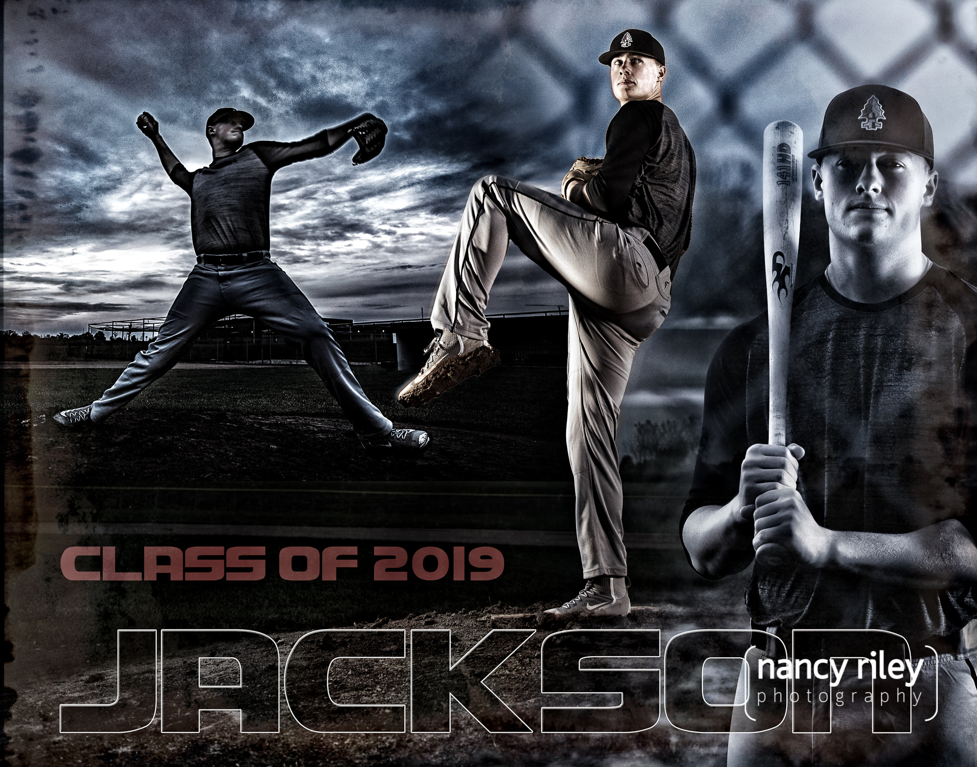
Making a collage is like putting together a casserole. Combine your fresh ingredients with some pantry staples in Photoshop for flavor, and you can come up with something with a few layers of complexity. I try to make my added elements fit in by matching typefaces and colors to the theme. In this case, I used a blackletter type to reflect the team logo, and repeated the star motif to set off the player’s name.

Sometimes you just want something simple in appeal, like this baseball card. The chunky serif typeface again resembles the logo, which is the main accent in the design.

At other times, it’s fun to let the creativity fly and make something exciting, like this baseball poster featuring action shots of the team. I kept the color scheme consistent with the Patriots theme, and added a spray of stars connecting all the players.

Of course, it’s possible to overdo it with the creativity. My own kids treat casseroles with suspicion, since I have a history of sneaking yellow squash puree into their macaroni and cheese, and they remember when I put an entire cucumber into their fruit smoothie. But then there is the occasional sleeper hit, like kale apple smoothies. My philosophy is to just keep experimenting until the magic mix happens.


Love it!